
PERILS AT SEA
Board Game
Digital Illustration
Print Design
Packaging Design
The Brief
Collaborate with a game design team to develop the full visual identity for a new board game. Create a name, logo, and packaging design that captures the board game’s adventurous spirit while aligning with the mechanics and themes developed by the game team. The visual system should be cohesive, marketable, and ready for both physical and promotional use.
The Solution
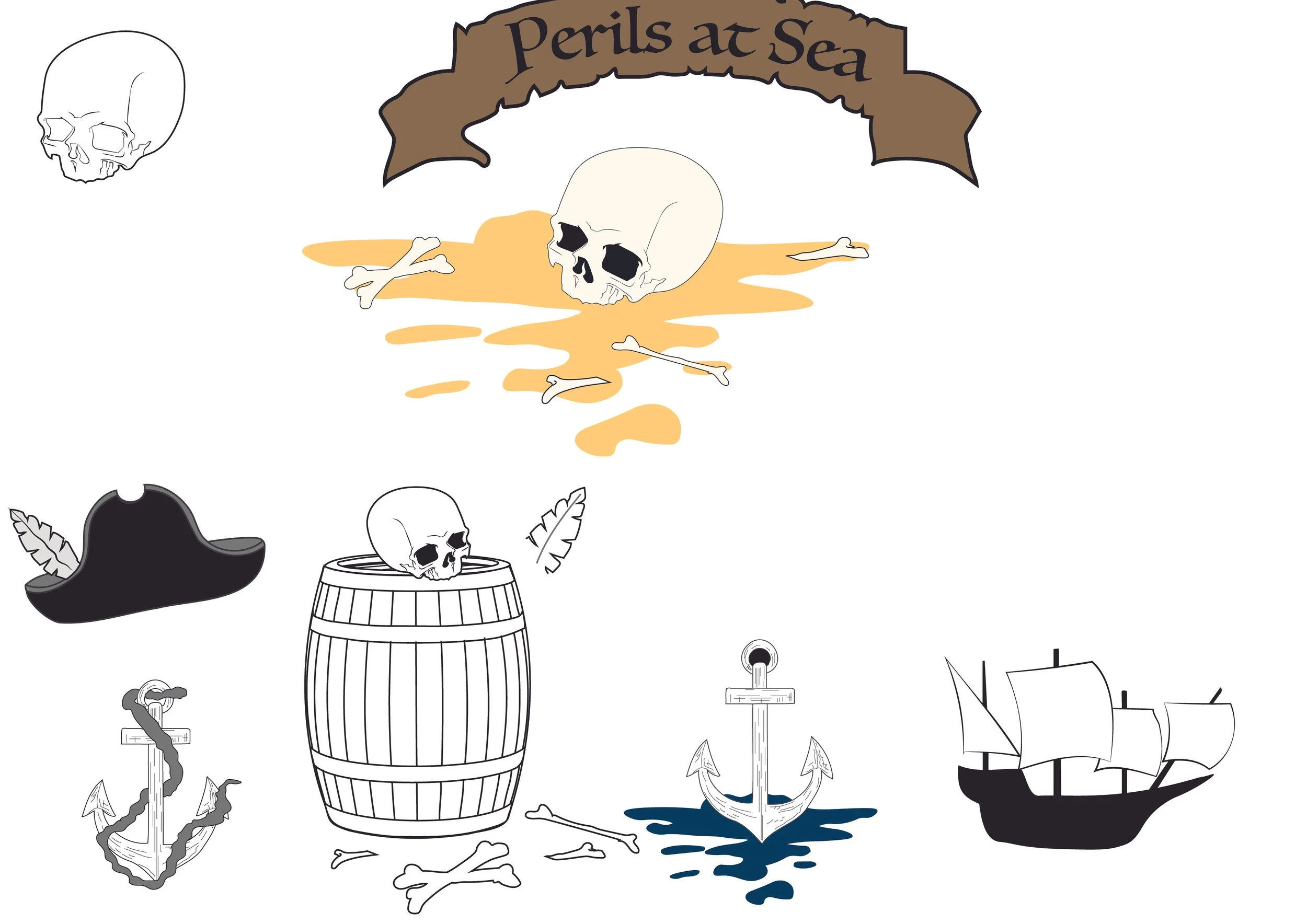
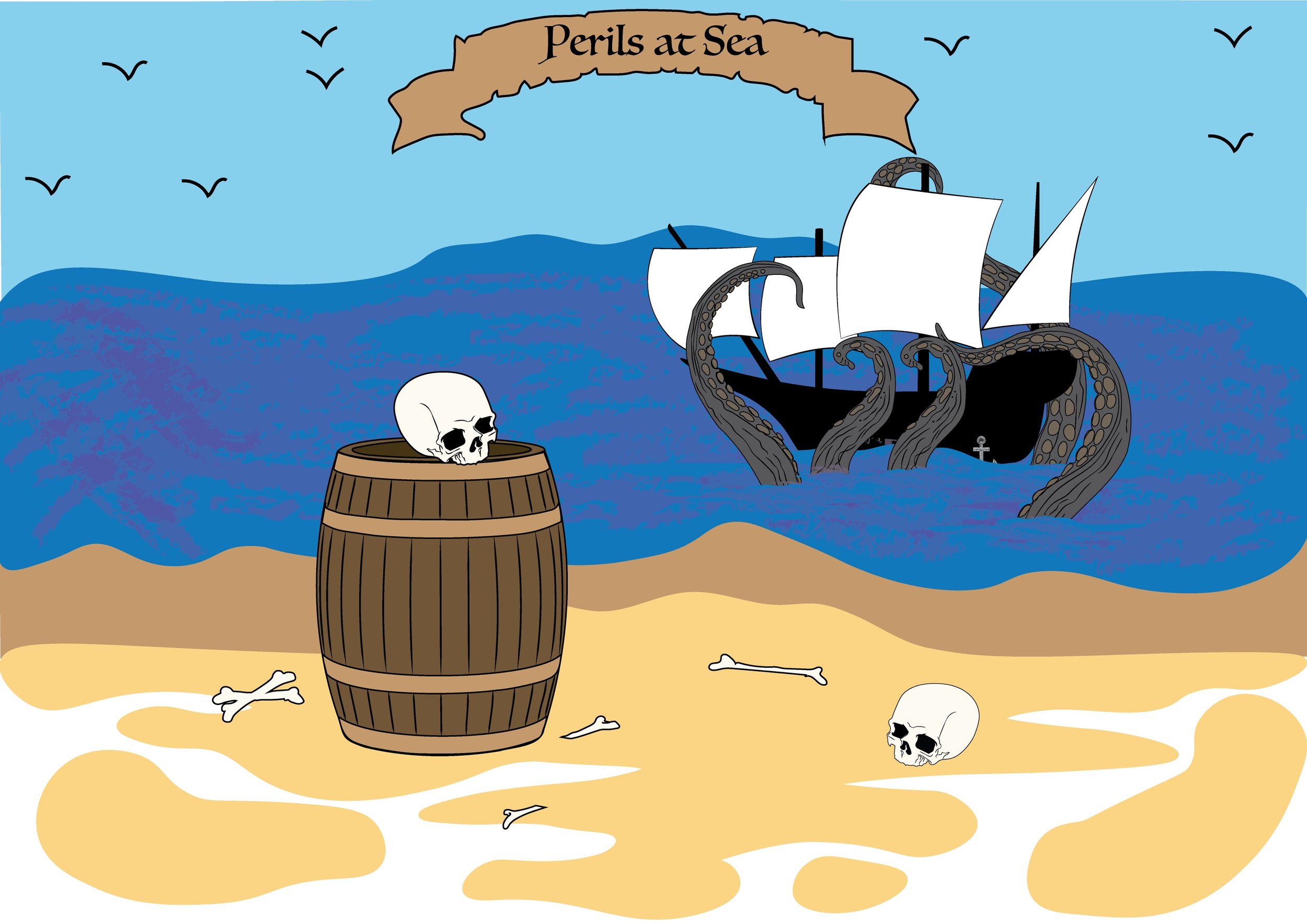
Led the creative development of Perils at Sea, a pirate-themed board game, by crafting its complete visual identity. I named the game, designed the logo, and created box packaging that reflects its sense of mystery, exploration, and high-stakes adventure. Working closely with the game design team, I translated their concept into a unified brand experience that brings the world of the game to life, from shelf presence to campaign potential.
Target Audience
Perils at Sea is designed for a wide range of players—kids and adults alike—who enjoy connecting over games in casual settings like family nights, hangouts, or group gatherings. Its pirate theme also appeals to those interested in adventure, strategy, or historical storytelling. Whether you're drawn to the thrill of exploration or just want a fun, easygoing game to enjoy with others, Perils at Sea offers an engaging experience for all.


AD Campaign
To promote Perils at Sea, I designed a series of three riddle-based posters—each themed around a pirate symbol: a map, a treasure chest, and a skull. Every poster links to a custom Google Form where users can solve the riddle for a game discount. With visuals that echo the game's tone and interactive elements that spark curiosity, the campaign brings the adventure to life even before the box is opened.


Design Details
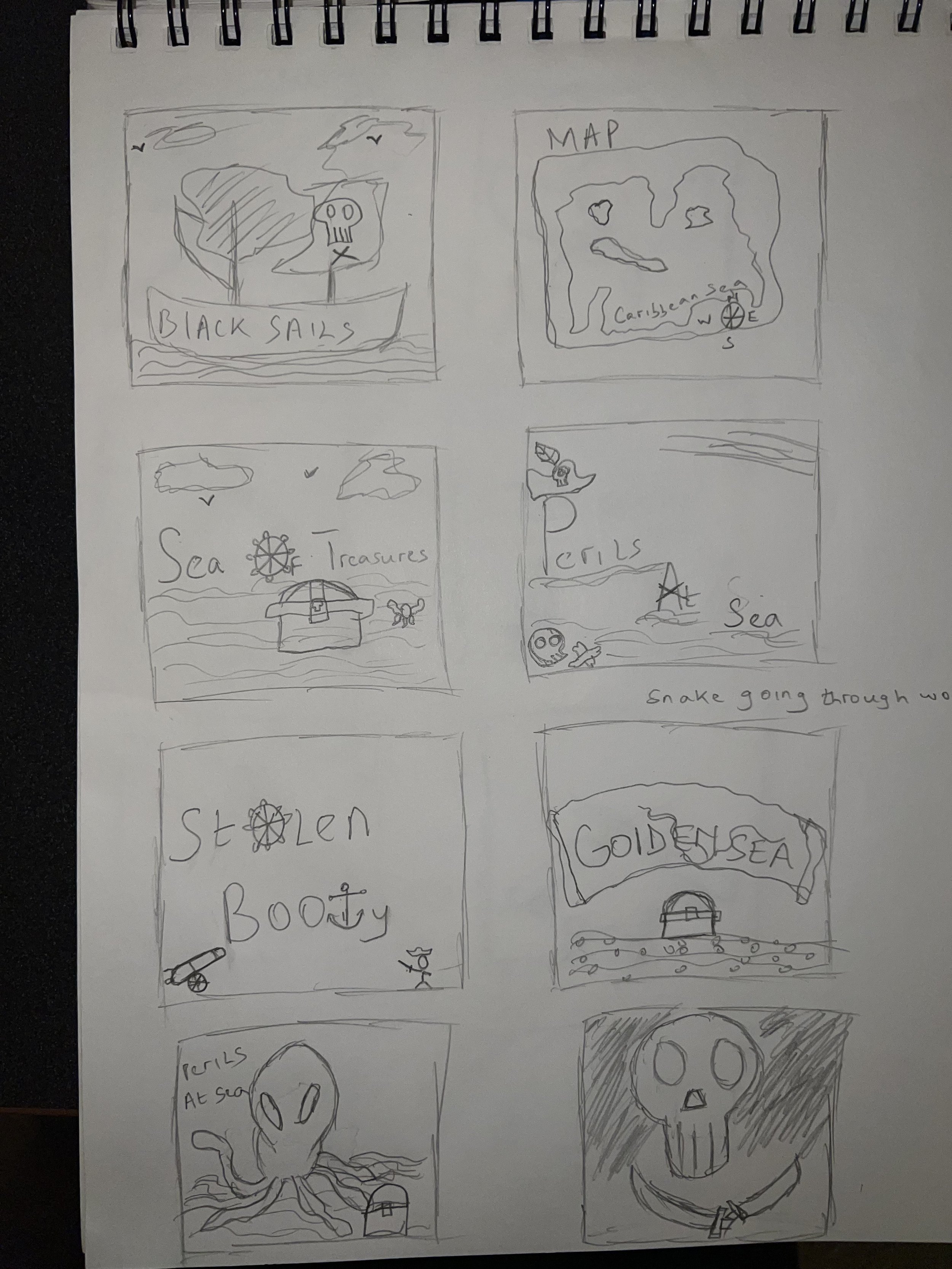
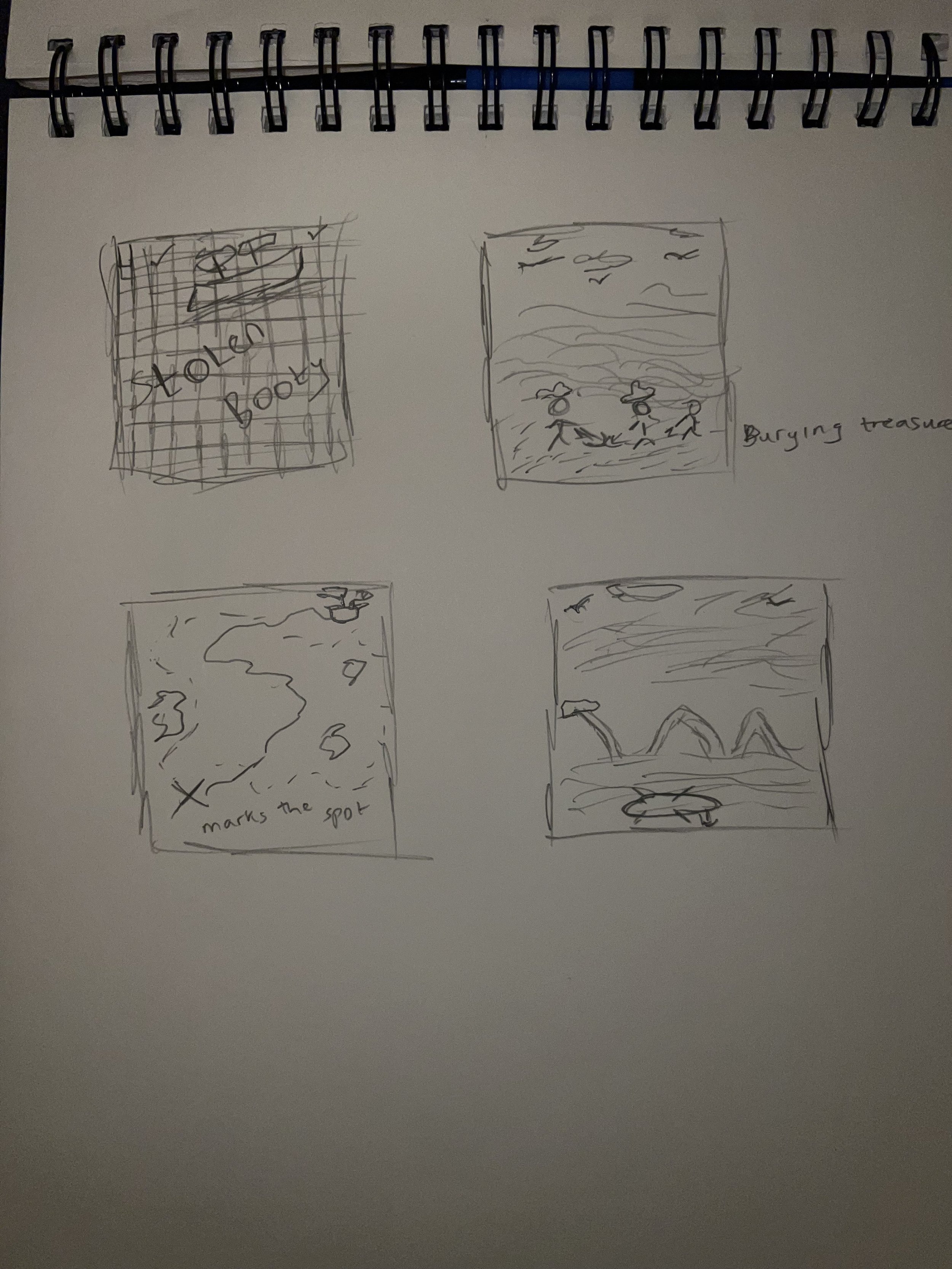
This project began with early concept exploration through both digital sketches and hand-drawn ideas. I experimented with different directions for the box cover, logo, and ad campaign visuals, exploring how to best capture the adventurous and mysterious tone of Perils at Sea.
The process included brainstorming logo variations, testing layout ideas, and refining visual themes for the posters. These early sketches helped shape the final identity and promotional materials, allowing me to build a strong visual foundation before moving into full production.


